Showing posts with label acrylic. Show all posts

Monday, December 1, 2014

Making Postcards for a swap


I'm making postcards again! I have just received my list of ten recipient addresses from Hanna Andersson via the iHanna Postcard Swap!  Love this swap and I almost made all my cards before the due date.  So again, I will be slightly late but all of my cards should be out in the mail this week.

I start this card with a simple drawing on vintage paper from music sheets and dictionary pages.  I had an inkling of an idea and wasn't sure if it would pan out.  I'm quite happy with this one.  I posted it on a FB group that I am on with and a woman commented on how she collected "pear" art so I sent this one out in the mail to her. I hope Susan likes it as much in person as she did from this picture.


This next postcard is still with me.  I haven't quite decided if I will just keep it our mail it out in my next swap.  I like the addition of the tree bark against the backdrop of vintage paper and watercolour. I call it "Sunrise over Lake Simcoe".  The lake is only a few miles from my home and I love going there especially in the morning to see the sunrise.

I really like the juxtaposition of elements in this card: the corrugated cardboard from a hot coffee sleeve and the bark beside the music notes and text page.


This next card is an acrylic painting of a book cover.  I didn't really much like the result so I have made it a mixed media postcard using gel pen for the sun over the wheat field and inked up bubble wrap for the orange morning sky.


I am not sure why I haven't mailed this one out either and I might as well for the next swap.

Monday, July 21, 2014

Attempting

Trying to add a post on my iPhone! and I did it, well I added the picture!  I created this piece as part of the Index Card a Day FB group!  It was an experiment gone awry!  The waves and the scribble lines were done with gesso and I rubbed dioxin purple acrylic paint on with a baby wipe.  I thought that I could get the gesso to act more like a resist but it didn't happen.  Possibly I picked the wrong pigment and might try this one again.


Instead of throwing the card out I decided to act stuff to make is presentable.  I cut out the butterfly images from an end roll of wrapping paper.  Then doodles all over the card with gel pens.  I used glitter, neon, and soufflĂ© Sakura pens. I like this card now, it was fun!

- Posted using BlogPress from my iPhone

Sunday, June 29, 2014

Experimentation

I have been doing art, honestly I have! I have slowed down on my productivity in my sketchbook but I joined up with Tammy Garcia over at Daisy Yellow Art to do the ICAD or Index Card a Day.  This has been fun.  I'm not really the best at it but so far I have enjoyed posting on to the Facebook group.

This is the card that got the most comments as it was a complete experiment that I saw in an art journalling magazine and thought that I would try it.  It is quite a multi-media piece even though it is on a cheapie dollar store index card.


I slapped on some soft gel to the vintage dictionary page, let it dry for a minute or so and then tore it off.  I really like the distressed look!  Since there was so much of the page that didn't distress I thought I would do another technique overtop of it.  I used the soft gel medium once again and applied it to a magazine page that had a picture of a rose on it.  I didn't like the way the image "transferred" and think that if I do this again I will use regular gel medium since the soft gel is quite a bit wetter and likely too wet for the magazine page.  I couldn't leave well enough alone so I then used my Uniball pen to outline the image.  Then I coloured in the image with my new Pebeo watercolours that I bought at the Junction in Toronto.

I don't know if you can really notice it much but at the bottom of the card where I show what paints I used I had attempted to distress some sheet music but without success!

Then I thought that I'd best push myself away from this although.  So there is my card for that day!

Sunday, April 28, 2013

Thank you card!

I couldn't believe it when a few days ago I received a letter in the mail and was the very happy recipient of a thank you piece of art.  The sender was the recipient of my 4 X 6 postcard exchange that I did through the Sketchbook Project.  How nice was that!!!  Her is Rachel's watercolour and graphite postcard drawing!  Isn't it lovely!!


I am very happy with my progress on my postcards for the swap.  I have finally completed the blue prototype and have to just find some creative lettering that I like to add my message to the front.


I would like to find more washi tape around but decided to use what I have although I don't really think it "goes" that well.  But really it will have to do as it is all that I have on hand in this colour and I might as well use it up.

The one thing that I learned from finishing this one is that I have to move the beads up more.  I ended up having to cover the ones at the end with the washi tape.  Bummer!  That is the reason that I do a prototype.  I am just not a very good designer/planner in my head; I have to use my hands and make one to find the flaws or make any changes that I think would look better.

I also decided that I didn't like putting the beads in the flower centres because there really wasn't enough symmetry for me.  I decided to move them to in-between the hand stitched crochet cotton which makes a clear and clean line.


With the photo above, I just wanted to show that I painted a piece of cheap paper with the peach colour in the ribbon and then stitched the beads on.  The soft gel was used as an adhesive and the ribbon attached to the postcard.  Then the washi tape was added for the final touch before the writing.

Wednesday, April 24, 2013

Postcard Swap-Prototypes


I thought I should show what I mean by junk mail postcards.  Here is one that I received in the mail last week.  I can recycle them in the bin or I can use them in my art.  And I am using an iTunes card to apply the first layer; gesso!


I
Here is the finished prototype in pink!  Now I just need to check the internet and come up with some creative lettering for my message!  I don't have enough of the deep pink ribbon so I will have to make do with blue.


In the photo below, I am stitching the ribbon to a piece of paper that has been painted a peach colour.  As the photo above shows, I stamped this postcard using the same stamp but some different ink.  This time I used Staz On ink pad.  The Staz On ink will go on "anything" and it actually does STAY ON!!


The thread I am using is actually crochet cotton that I got at a charity shop.  I think it works well. 

Tuesday, April 23, 2013

Postcard Swap #4 Prototype

I think that I have got my next batch of postcards are all figured out.  I made up a prototype and I think it will do just fine.  I thought that I would change it up and not use my felting technique although it is still my very favourite!


I hand stitched the two pieces of organza together.  Then, I applied some acrylic paint on to some paper and it is the backing for the hand-beaded organza ribbon strip and adhered them together with soft gel medium.


I then applied a layer of pan pastels and covered it using my homemade stamp (yes, it is the erasure that you can get from the dollar stores) with pigment ink.   I made a pattern on the other side that I have used quite a few times but had not used this side yet.  Next was a wash of thinned down gesso; not too much just enough to lighten the stamp images.  I might even have to lighten it up a bit more.  For this prototype, I think that I will just have to use different ink to but on my letters and words, my message so to speak.

There is only one problem, I don't have enough ribbon to complete the 10 postcards.  So I guess I will have to figure out something else for the last few cards. The real issue here is; I don't want to buy anything else.

The last two stages are apply purchased washi tape and my message!  

Monday, April 22, 2013

A Blank Canvas

Oh boy!  What to do!!  I just never even thought about how small a 4 X 4 canvas really is!  I always find that a blank canvas is kind of daunting for me.  I think I am going to have to throw on some colour to get over that.  I might try some of my pan pastels for now.   Just not too sure what I am going to do; what medium I am going to chose.  I would like to do something interesting so I think I should stick with my felting/beading mix.  Regardless of my choice; I have until August 30th to submit but really I need to get this done sooner rather than later.


The people from the Sketchbook Project have very clear rules:  no glitter or glue and nothing that will "fall off" as they sort them I guess.  They are concerned about damage to other participants art work.

I participated in several other The Sketchbook Projects and I received a letter some time ago for the "50 Things" project.  This project swap was about writing down 50 things that we plan on doing in the coming year.  I received mine from a very nice lady in Alabama (I originally thought it was Alaska until I checked this morning!).  She had been disappointed with the 50 Things list she had received and appreciated my e-mail and the fact that I included my own.  We had many areas in common it seems!  So that was a very cool project and I hope that this one will be too.

My new friend has received her blank canvas as well and was wondering what I was doing with mine. Nope not a clue yet, still pondering!

Oh, that blank canvas is staring at me!!

Tuesday, April 16, 2013

Tagged and Swapped

I love these because I am recycling what would normally be garbage and making these cast offs into something useful again!


These will soon be gift tags!  I got this idea from Alisha Burke and you can find her blog on Google.  She is always doing something fun!

The red cover sheet below the tags will be another envelope for the next postcard swap that I have joined yesterday.  The swap is hosted by Shannon Ganshorn and you can find her on musingsonrealities.blogspot.ca to join up, there is still time left.  If you check back on my blog you will see some of the examples of my postcards and envies.  

I must get going because it is going to be a fabulously sunny day and I want to go for a walk and I have to get my junk mail cards painted up (you know that I like to recycle - right?!!) before I can start making my postcards for this swap.

Friday, February 15, 2013

Music and more about Postcard Swap V.3

I love to listen to music when I am creating my art and I came across this woman sometime ago from another artists blog.  So here I am.....I am sharing the beautiful voice of this woman too.  I don't use this video, I just went to iTunes and purchased several of her songs to appealed to me.  Again, perfect music for making art; well, for me that is.


My next favourite song is Nadir (Synchronicity) and then Forrest Veil.


 I must admit up front that visually posting these photo's of my art here, I find these postcards a bit too "hot",  too visually over-the-top.  However, in real life my eyes didn't see it that way at all.  So, I will of course all be in the eye of the beholder.  I hope everyone who receives them thinks so too.


The organza is a bit difficult to photograph because of the the nature of the fibre; the glare effects that it creates with the lens of the camera.


 I don't know how the flower motif was created really, it just sort of "happened"! I really liked it.


I photographed this one sitting on it's envelope.


Here are the envelopes all in a nice neat pile!  All ready for mailing!  I hope to be able to get to the post office today to do just that.  I hope all of my participants will forgive me but between work (today is my one day off for this week) and the stormy weather, I haven't been able to get there.


This is my constant lament though so bear with me for the next challenge!  At least I hope that Shannon is willing to host another challenge.  I love to participate but I am somewhat of a procrastinator and then of course I never chose something that is easy peasy either.

These are time consuming because I have to make everything from scratch, right down to the hand made "artist tape"that is the finishing touch.  I don't have a cookie cutter process and probably never will because I would get bored doing that.

I am really glad to be able to re-cycle my drop sheets from other projects.  I had figured that I would have to put them in the burn pile since I had hung on to them way too long.  So, I hope everyone does appreciate the colour if not the oddity of the craft!!

Monday, July 30, 2012

More Postcards

I found two more postcards photo's...although I still don't have all of them.  Oh well, such is life!  I just received another comment from one of the recipients of the swap and I think that I enjoy getting the comments in my e-mail box as much as receiving the postcards.  Well, I shouldn't go that far, I really do love receiving the mail better!  Now, there is nothing much in the mailbox but boring nasty bills and junk flyers.


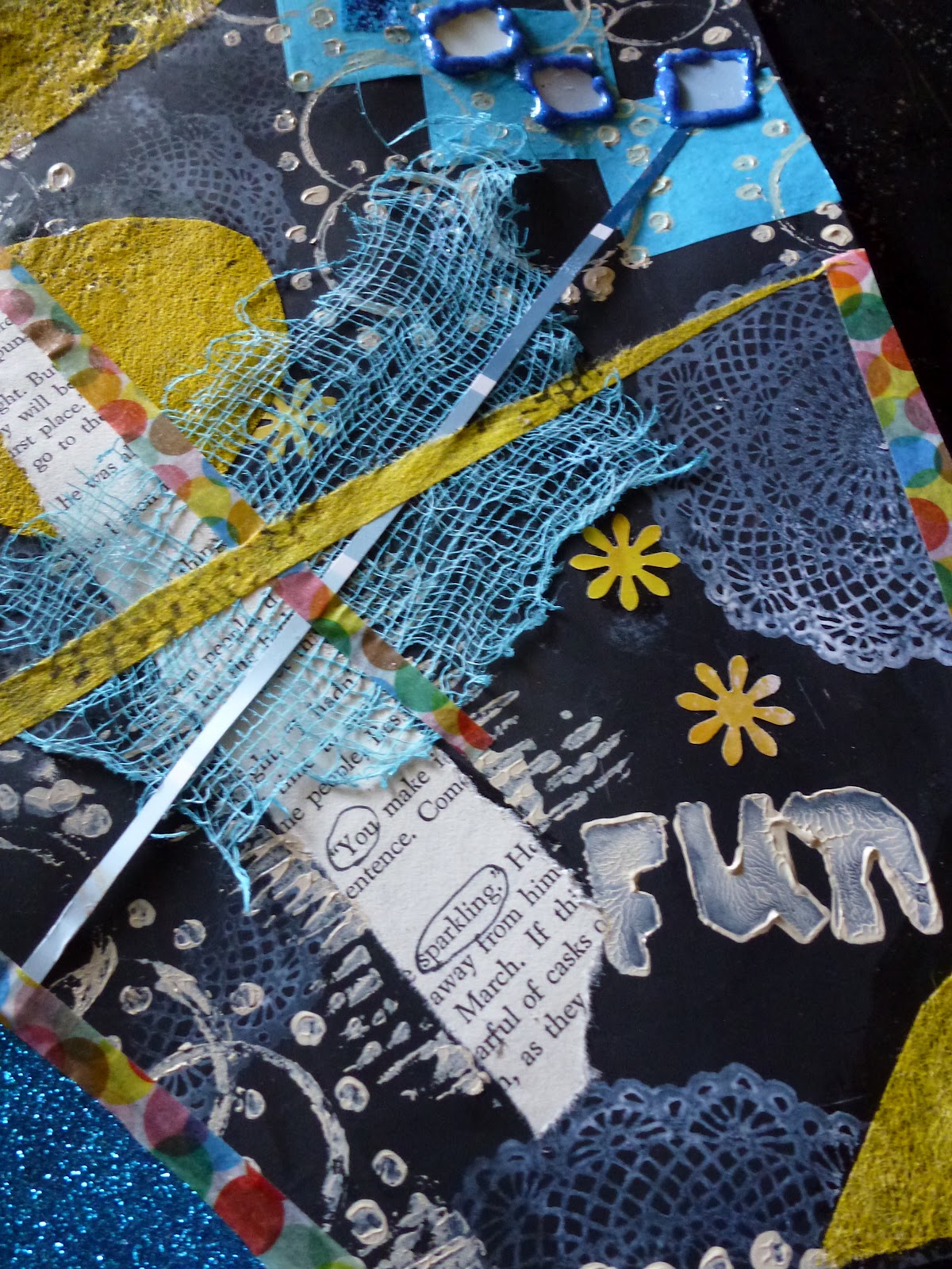
As below, I used many of the same elements except that on this piece I added dyed household cheesecloth as an accent. and the paint chip sample were cut into squares and glitter glue added to secure them.


This FUN postcard has the words "highlighted" of You....sparkling!!  I think that anyone involved in this swap would have sparkling creativity and it should be acknowledged!


I was happy to see that these two cards are quite similar, so it would be easy to put them here together.

As you might expect by now....I used:


  • Paper slice from an unwanted book
  • re-used and painted dryer sheet
  • paper punch cut outs from an old magazine
  • sticky glitter paper
  • purchased lacy stamp
  • handmade white erasure stamp from the dollar store - FUN
  • handmade "artist tape" in yellow
  • used for mark making: soda pop bottle cap, the end of a paint brush and hot coffee sleeve
  • sliver of a paint chip sample
  • washi tape purchased from Etsy
Most important of all.....I had FUN!!!!  Summer is all about fun since our summer is so short!

Wednesday, July 25, 2012

Postcard #5

I can't believe it but I found some extra photographs of the postcards that I mailed away.

I really do need to "get on it" and follow through on photo taking.

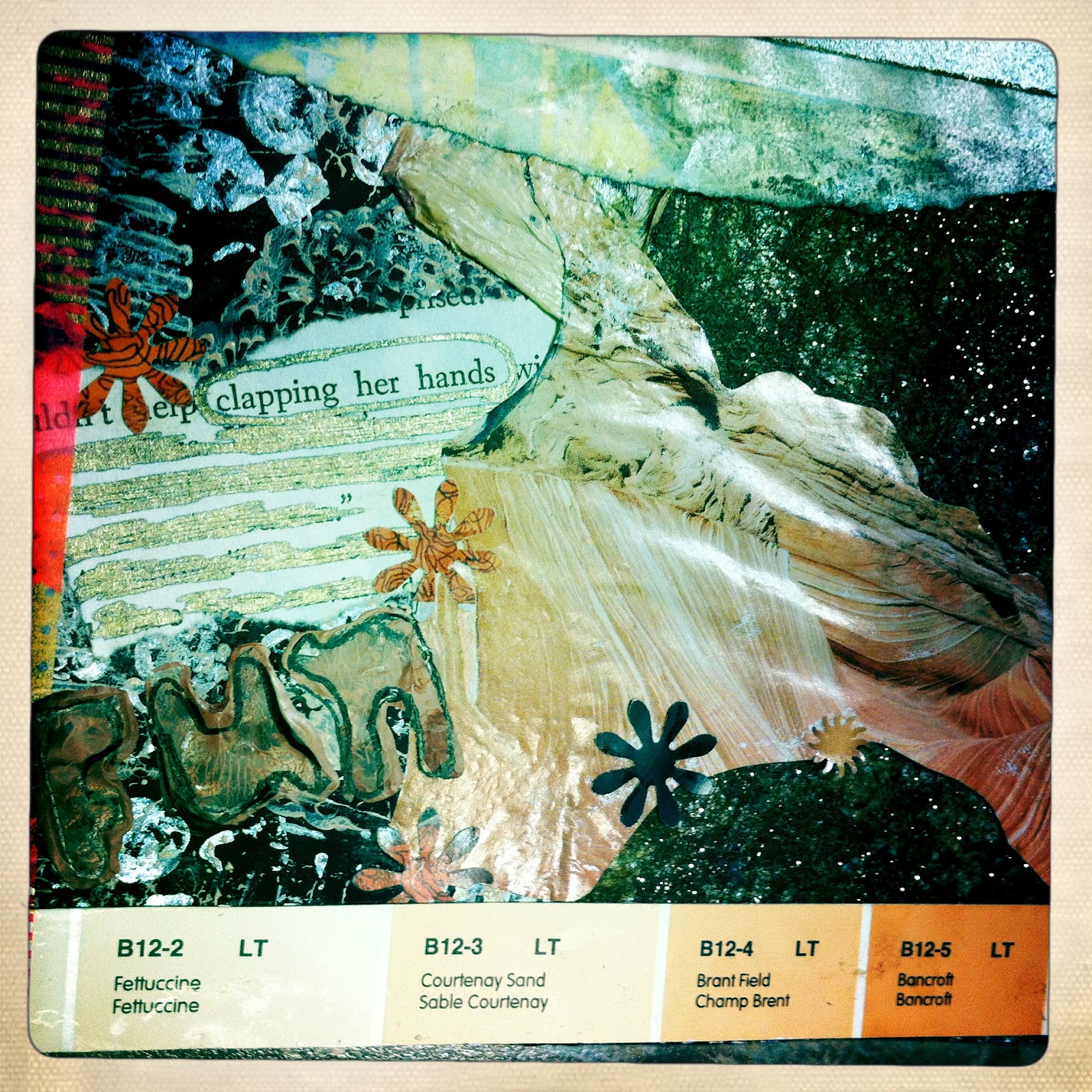
So here is another rusty orangey one:


  • I used a recycled junk mail card
  • painted and glittered used dryer sheet
  • old unloved book page
  • magazine image
  • paint chip sample
  • other bits of distressed magazine
  • punch cut pieces from old magazines
  • washi tape purchased on Etsy 


I took a pen and cancelled a bunch of the text and was left with "clapping her hands"!  I love that image!  It is what my little 7 month old grand-daughter does! 


Hmmmm, the magazine image rippled somewhat when I pasted it to the card.  Not happy about it but it looked better in person that in this photo!


I love the theme.....it was FUN!!!!


Tuesday, July 24, 2012

Postcard Swap Envelopes

I just received a very nice comment from one of the recipient s of my postcards.  I just realized that I have not been very diligent at taking photographs of my cards.  I was so intent on getting them out because I was sending them out "past due".  Oh well, I don't think the recipients will be upset over that!

 I love mail, or at least, this type of mail and love going to my mailbox to look and see and be "surprised"!  I am so happy that I have just received my tenth and final card yesterday!


Here is a snap of some of the envelopes.  I didn't want to send out the usual morning white type and really enjoyed making these out of stuff from around the house.  I have way too much gift wrap so it made great envelope material.  I also got to use up some of the brown paper bags that I seem to be accumulating.  I found some cheap tape so I trimmed the paper bag envelopes with that!  So much fun!


I especially enjoy the connection of other people from around the world.  I hope to get a comment on here from Germany.  Now that would be very cool!!!

Monday, July 16, 2012

Postcard #4 - Hot, Hot, Hot

Oh my it is just so steamy these days and tomorrow is suppose to be around 29!  Ouch!!

So here is another of my postcards that epitomizes the season!!


I like the square vintage format of the snap above but actually the postcard is much larger so I was forced to take a full sized one too.


I love hot pink and black together.

To make this postcard I used:


  • junk mail card
  • acrylic gesso and paint
  • strip of paper from old unwanted book
  • strip from a colour swatch
  • purchased lace stamp
  • handmade white erasure stamps: HOT and FUN
  • mark making with stuff from around the house - corrugated cardboard hot coffee sleeve
  • hand made "artist" tape using painted and stamped paper bandage tape
  • paper punched cut out out shapes from magazines
  • old bingo sheet
I have circled the words IMAGINE IT!  I think that it is something that we all need to do...imagine it!  Imagine....Hot.....Fun!!!


This too was fun to make!  My cards from the swap have come and I have gotten almost all but I seem to cap off at 8 out of 10 postcards.  

Friday, July 6, 2012

Postcar #3 Part 2-Rose Collage


First, there was a bunch of rose flowers on our florabunda rosebush!!!! My hubby has the green thumb in this family.  I like to take photographs and that is about it!!!


I had a chance to grab some petals that had fallen off in the wind.  I put them on a release paper sheet, actually re-used the wrapper that our photocopy paper comes in at work.  I often drag them home to use for art projects!!  The girls at work think that I am odd, but that is okay with me!


I didn't wait for the petals to dry; I just applied gel medium on them right away.  I think I used fluid matte medium to be exact.  I coated one side and then the other.  I did dry some others that I had picked and I will see how them are in a similar project.  I think I rather like the petal this way since they are not exactly flat and creates visual texture.

You can see them on the right edge of the photo below.  I just used more gel medium to apply them to the postcard.

So for this rest of the postcard I used:

  • applied black gesso to a re-cycled junk mail postcard
  • re-used a sewing pattern and seam binding from past projects
  • bingo sheet
  • paint colour swatch
  • painted and glittered dryer sheet
  • stamps made from around the house items


I also used one purchased lace patterned stamp that is in behind the sepia coloured dryer sheet.  In addition, on the top left you can just see a piece of paper cut from a magazine of something looking like  zebra's.  The image was distressed so not much of the image is really left but just the right amount for this project.


Although it had been my intention to stamp FUN on each postcard; because they were fun to make, I decided to omit that from this one.  I like a bit of busy or should I say "organized chaos" but there is a point of no return.   I just knew that I wold not be happy.

Oh, I just wanted to mention that I got a nice comment from a woman out in the worldwide web!  Nice comments are always great to receive.  Who know that a woman from the U.S. would  1. find my blog and 2. take the time to comment!!!  Thanks to all who do, I appreciate it!


Sunday, May 20, 2012

Thinking of Sandy

I thought I was done but apparently not.  I have tinkered around with the card since my last post but I think now that it is now complete.


To make the mixed media art postcard I used:


  • recycled junk mail card
  • magazine images, text and punch cut-outs
  • organza ribbon
  • acrylic gesso and paint
  • sharpie pen
  • oil pastels
  • paint chip colour swatch
  • glitter glue
  • bingo card 
  • glitter sticker paper 
I had a lot of fun making this card!!!  Not everyone will comprehend the reason for some of the imagery but that is okay since it is very personal. 


Saturday, May 19, 2012

This and That

I'm home alone!  I love having the house to myself!  My old guy is off fishing with the boys and I am on holidays.  Sweet!

I woke up at 0300 hrs this morning and I tried to lie down again but I got up to see who had sent me a text message.  It was from my daughter of course!  We had a good chat and a plan was made for me to go south to see the family on Tuesday.

I wanted to take this time to do some art.  It was my intention to get quite a bit done on the postcards for the next postcard challenge that is about to begin.  I don't really have much to show for myself yet but these to pictures.

The first is a drawing of a male face that I found in a recycled art journal that I started some time ago.  I just liked the green and blue colour and finally after looking at it for a time; I saw what looked like a face. I just followed the lines and this face formed.  Fun!  Not a lot of effort but fun nevertheless!


I hope that it isn't similar to the face that was found in the toast.  It isn't meant to be anything serious, it as just kinda cool to actually see something on a gessoed page that was just plastered with leftover paint.

The next picture is a postcard that I am making for a friend who has cancer!  I thought I would do up a "thinking of you" card.  Just because - just because I can!


It is a mixed media piece using a re-cycled mail card that I keep getting in the mail.I gessoed it too and slapped on some paint.  Then I doodled on it with a Sharpie.  Cut out some images from magazine pages along with some text that I hope she takes as a positive message.  There is also one piece of a National Geographic that I had treated with CitraSolv for it didn't really cut through the ink (I must assume that I didn't apply enough liquid to the paper).   I will pop this into a gift wrap envelope that I have cut yet and mail it out on Tuesday before I head to Toronto.


Tuesday, April 3, 2012

Mixed Media Fibre Art Card

I made a fibre art card last month for a friend's birthday, that day has come and gone so I thought that I would display it here.


I have been enjoying myself very much making these small art pieces.  I used:

  • glass beads
  • recycled onion bag netting (painted)
  • sequins
  • metal sewing notions - black and silver snaps
  • embroidery floss
  • cheesecloth
  • acrylic paint
  • molding paste texture medium
  • purchased embellishment
  • Strathmore watercolour postcard
I didn't really have a "plan" per se and it just could be that is why I like it so much.  I could have made it so much more but really I like the simplicity of it just as it is.

I am really glad that I choose to join the international postcard swap in January of this year as it has taught me to work smaller and to experiment with these small art pieces.  


Saturday, March 10, 2012

Postcards-Added Embellishments

Here are two more photo's of some changes that I made to two of my cards.  Although I was bound and bent not to make any changes, I broke down on these two.

The brown needle-felted card was only slightly embellished using some glitter glue to accent between the dark "frame" and the paper background.  I think that it is a definite improvement!


When I posted this one, I didn't really like the way I had applied the interference paint on the one side.  It made my eyes go to the spot right away.  I had to change that!  (because I can).   Since these two were done with acrylic it was fairly easy to make some changes that I think improved them both.


I'll be looking forward to doing this swap again.  In fact, I am going to be making up some more now (or rather as time permits!).

Thursday, March 8, 2012

Postcard #10 - Pink and Blue

Okay so it has been a few days and I haven't been on line due to a really horrid Rogers tech who didn't know what he was talking about and got me to trash some vital applications from my dock on my MAC.  Luckily, I called Apple and they showed me how to retrieve the app and put it back on my dock from Time Machine.  I have never had to do that before and since I didn't have the internet I couldn't google how to do it either.  I can't understand Rogers not keeping up with the new technology that is not PC related.  Apple is not going anywhere soon so there is no reason that their product development division should keep their heads in the sand by not making their products MAC compatible.  I was told that their product was not compatible with Lion.  I know that they advertise that the new Rocket Stick system requirements is OSX 10.4 or better.  The "or better" is a bunch of hogwash!!!  I mean really, the new Mountain Lion operating system is coming out this summer!  Get with it Rogers!!  Love my time machine and love my Apple Care protection plan!!!


Here are some photo's of my final postcard:

I used a recycled paint product from Tri-Art paints called SLUDGE in a blue shade.  It is the left over paint from their processing plant.  I like to use it under anything that I need a dark base.  I use it on things like picture frames and such like when I want to cover over what was and make something black.  You get the idea! 
I dyed the fancy ribbon pink the same as the left side.  I used screen printing paint since it was the only thing I could find that was the right colour.  I liked how it didn't make the fabric ribbon stiff and I didn't have to apply fabric medium to the paint. 

I think that I like the fact that I decided to leave the painted cheesecloth loose on the card.  In addition, I didn't paint the metal foil either!  This time I like the shininess since there is only a little bit of sparkly stuff on this card so the shiny factor isn't overpowering. 

I think that I might have added more bead and sequin embellishments but I have finalized it and am relatively satisfied with the results.
Here is a close up of detail


I think that these photo's show the progress sufficiently!

For this card I used:

-Strathmore watercolour postcard
-screen printing paint
-recycled paint
-organza and netting
-cheesecloth
-beads
-sequins
-metal foil

Now, I just need to get the cards stuffed in the envelopes and the addresses completed; then the final walk to the post office!!!

Friday, March 2, 2012

Postcard #9 - Painted Lace & Twigs

OMG! Is it just me or is time ticking away a lot quicker than usual.  I had hoped to get all of my postcards mailed out by now but I'm not quite finished.

I can't believe how late I woke up this afternoon!  Why is it that when I am working and need to sleep I can't?  Why is it that when I don't need or want to sleep in, I do??!!  I think I got to get off the sleep deprivation shift work roller coaster sooner rather than later.

Okay....this picture shows how I was "thinking" I might put this postcard together.  I had painted two different types of lace ribbon that I found at a charity shop.  I had "made" quite a few thread wrapped twig "buttons" and had arranged them on the card.


As you can see this is not what actually ended up happening.  I thread wrapped another twig (yup debris from the maple trees that fell on my deck) in a variegated thread.  I had ironed some pleats in the transparent turquoise coloured organza and then beaded that down with monochromatic coloured glass beads.  I finally did use the embroidery floss above but not until the end.


I like leaving the frayed salvage edge on the fabric piece and I didn't finish off the edges of the pleated piece either.  The thing I had difficulty with is applying the twig button embellishments.  They were not as easy as I had originally thought.  I'm just glad that I was able to save this postcard from the garbage but at first I had thought that I had really made a dud.

I applied the fabric to the postcard using matte gel medium.

As you can see my "design" was not well planned in advance....I had a notion of what I wanted but the final design just sort of happened.  I wanted the embroidery floss to be in the card and had not really factored that in.  

I hadn't really thought about it much other than I wanted turquoise and orange and it took me a while to see the boat and sky with clouds that this card finally became.  I had wanted to keep everything in balance; the "sky" is one third and the water is 2 thirds of the card.  My "boat" takes up half the card and it meets edge to edge so I think there is a balance there as well.   If I was to do this again, I think I would add more turquoise beads to depict the ripples in the water.  Of course, I didn't think of that until I had already finished off the card. 


I think now that I might like to make another one but use a creamier orange colour and just dull it down a bit.  I think I have some lighter coloured orange thread around is my old sewing box that might be the ticket.


Again I applied acrylic paint to the metal foil finishing tape to dull down the shiny gold surface.  I do quite like the abstract nature of this postcard and was happy to see that it "finished up" quite well.

For this card I used:

- Strathmore watercolour postcard
- acrylic paint
- paint dyed lace ribbon
- organza
-glass beads
- embroidery floss
- thread
- wood twig "button" embellishments
- metal foil

I think that is it!  Very pleased